MATCHA WIth benefits


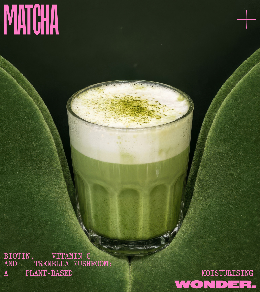
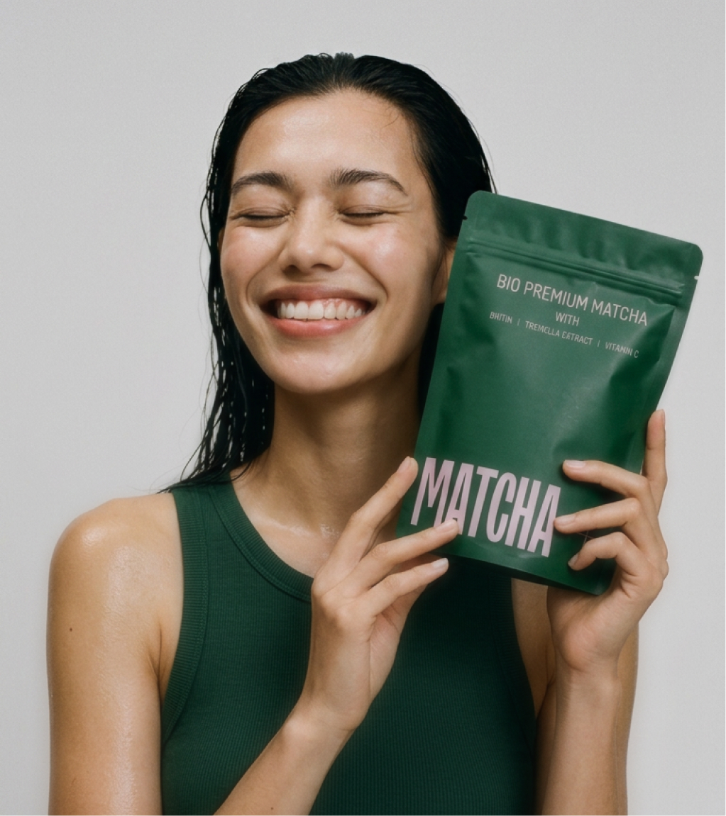
Matcha + a German cosumer brand launching on the market looking to differentiate itself from the other products as being a matcha with extra benefits.
INFORMATION
Matcha + 2025
Role Brand Designer + Art Director
Consumer Brand
description
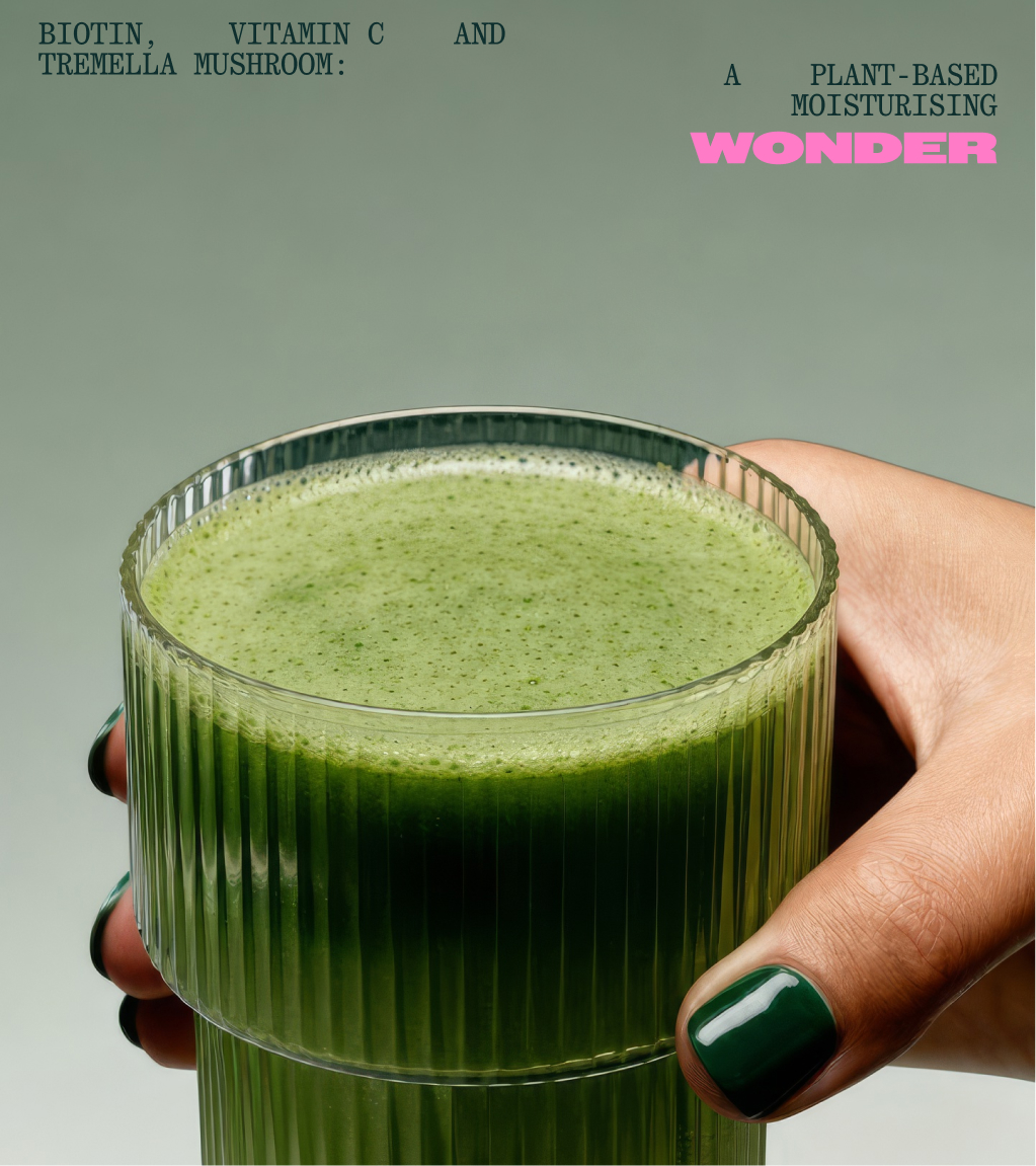
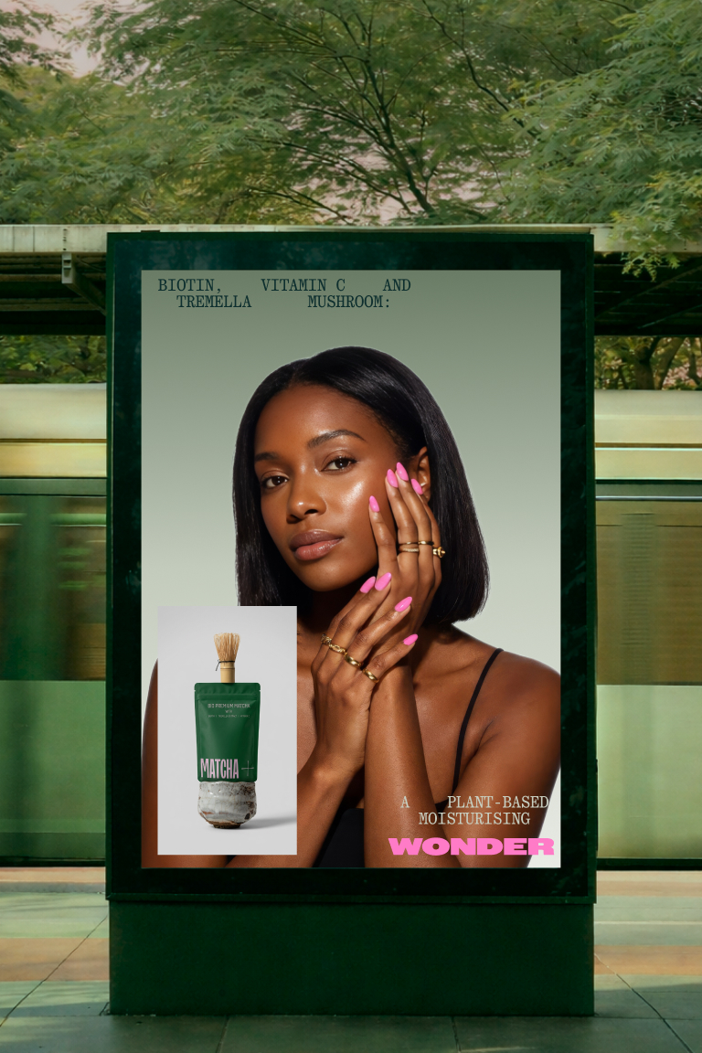
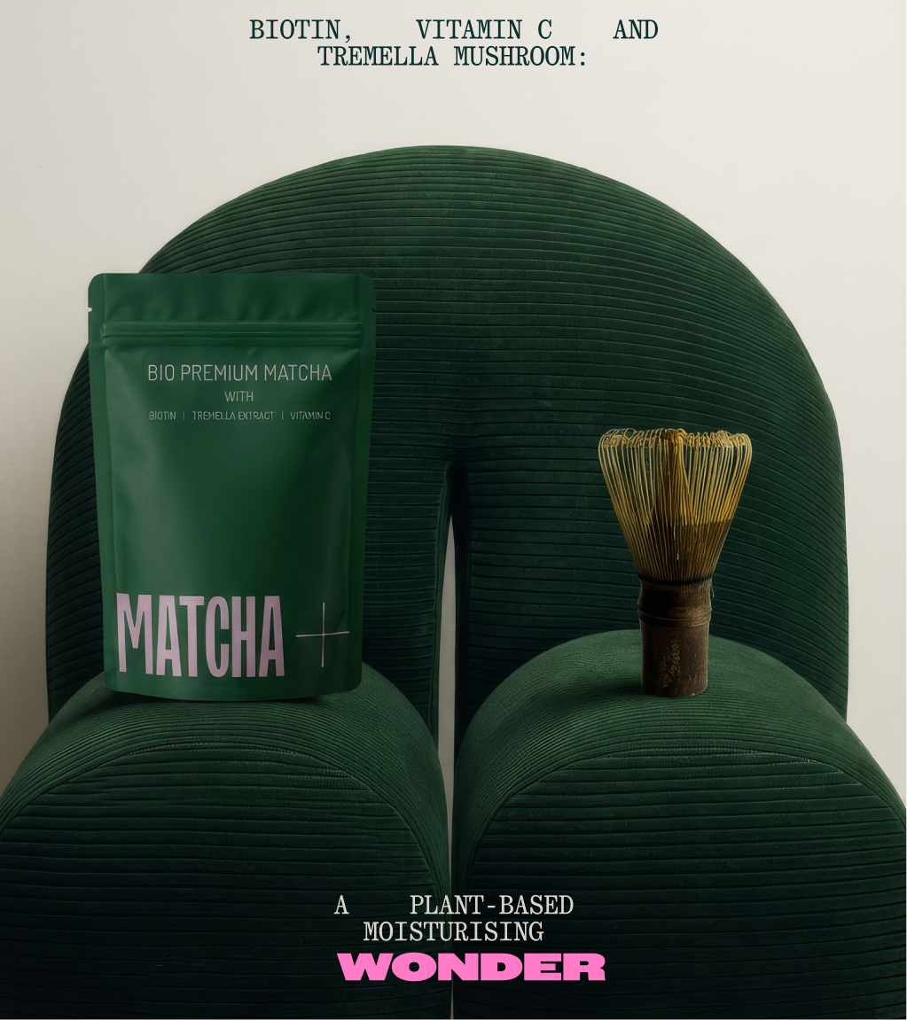
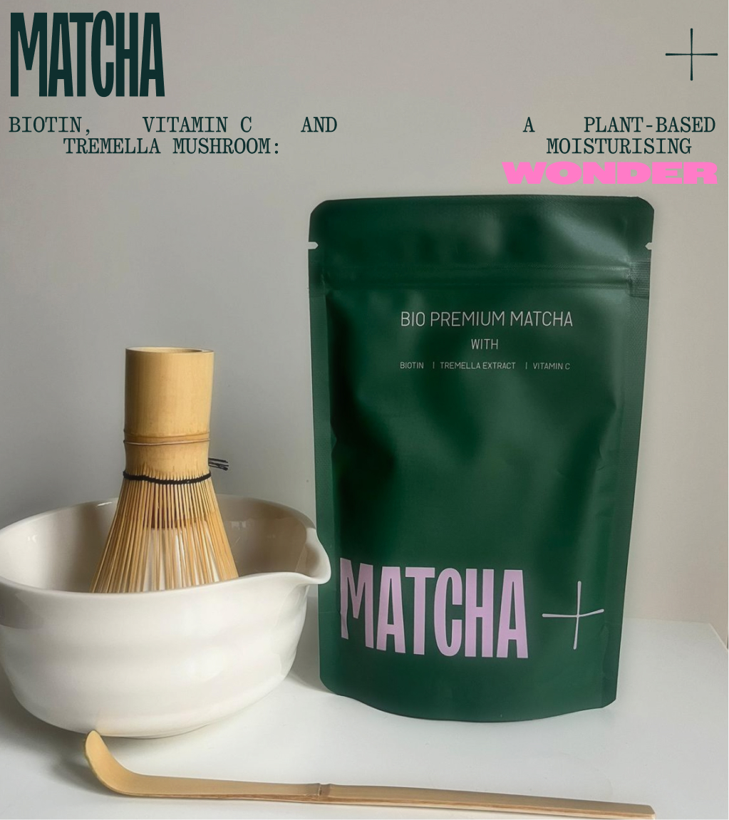
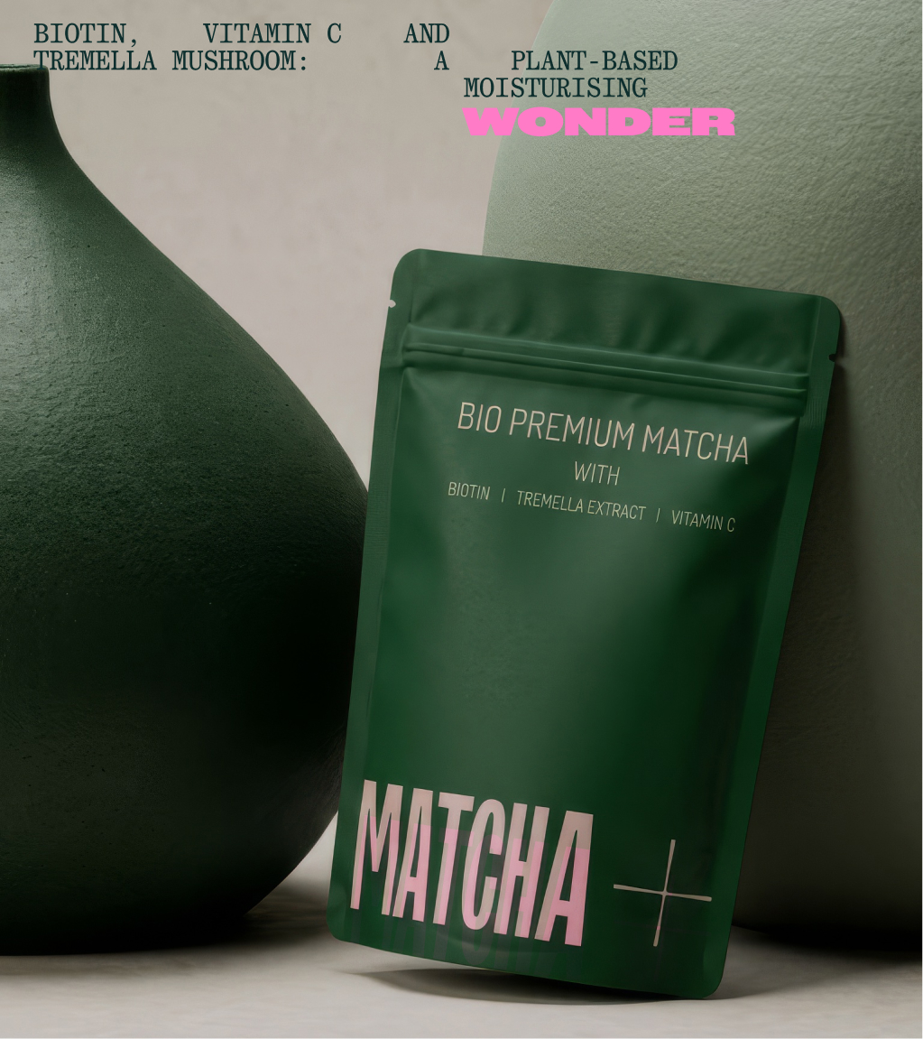
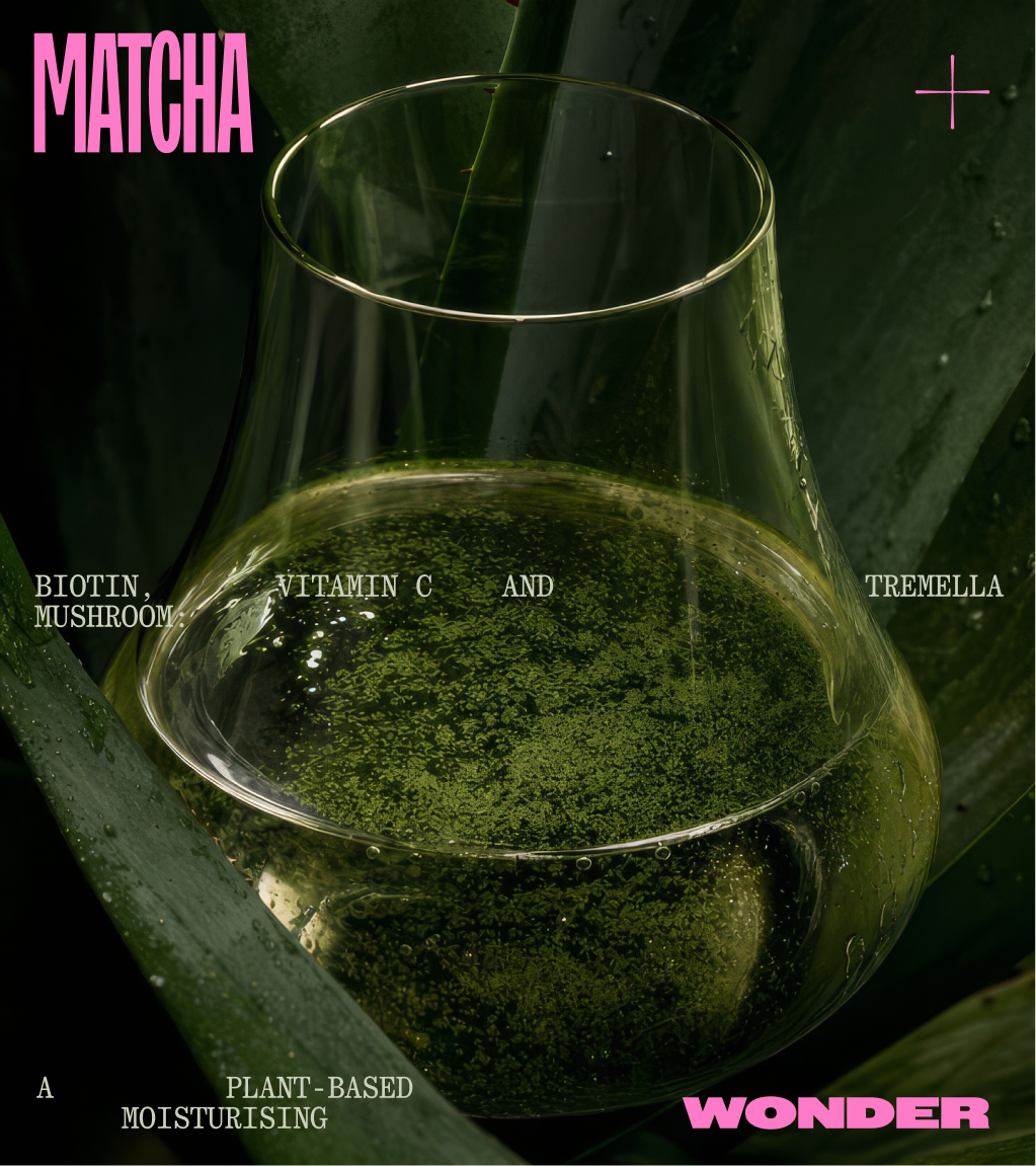
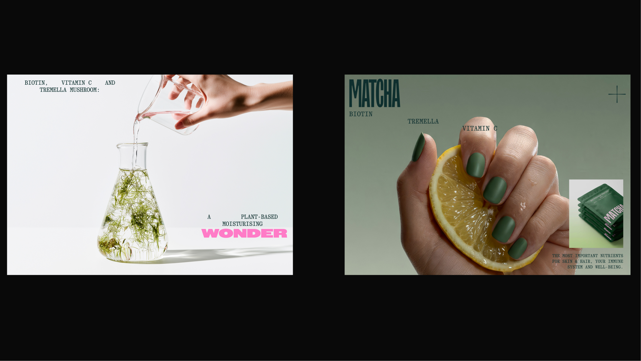
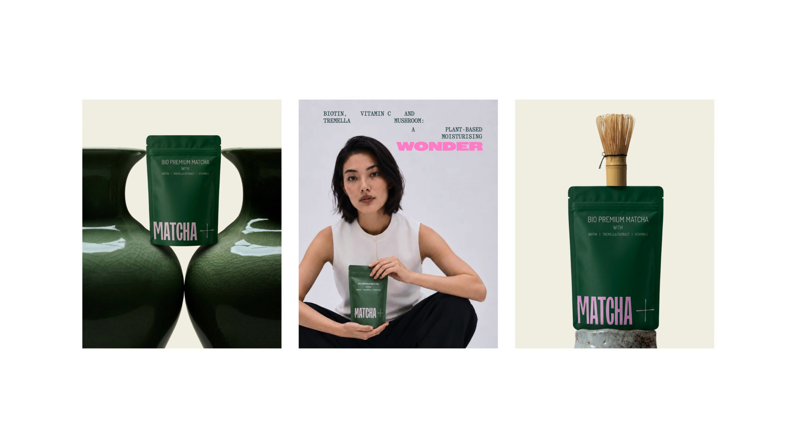
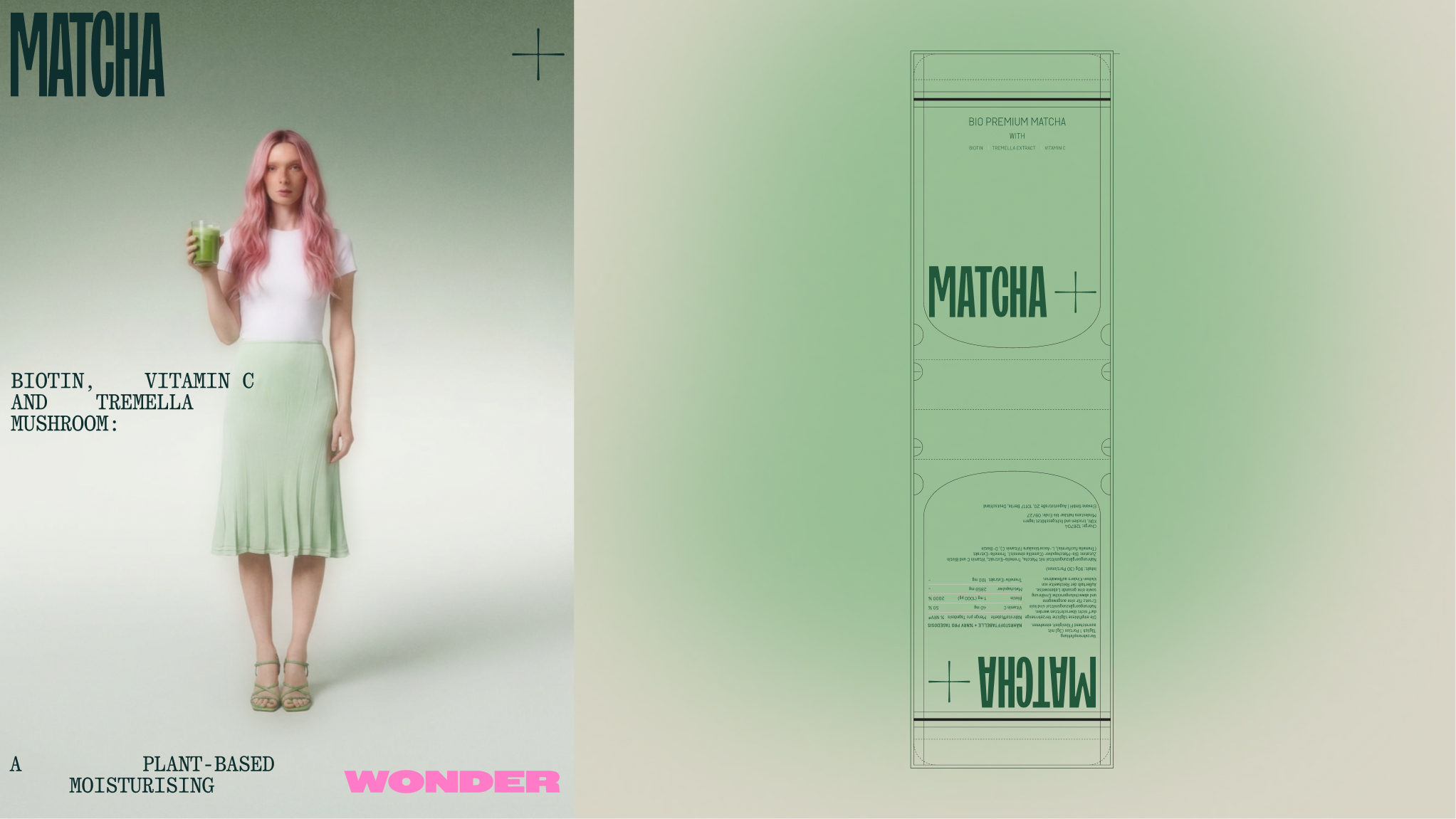
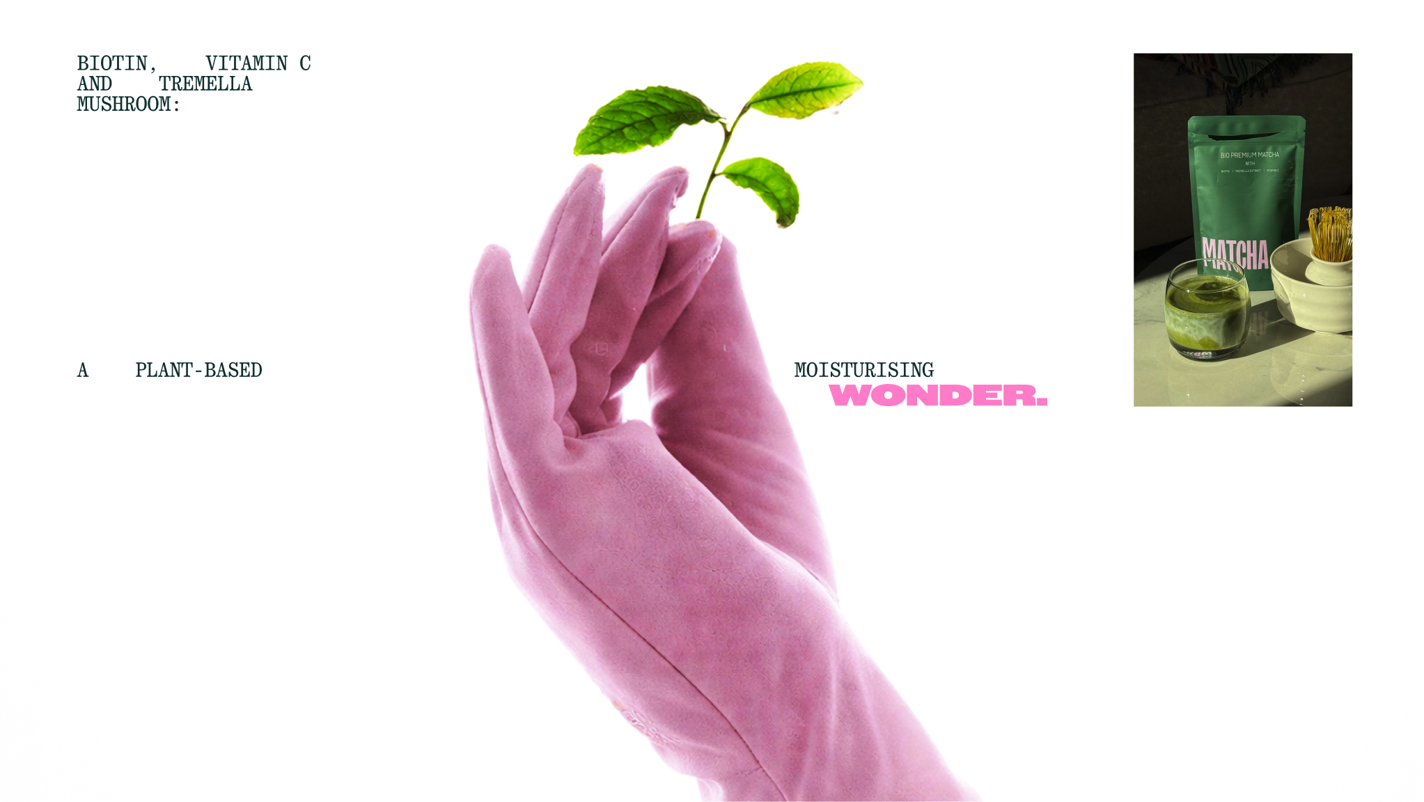
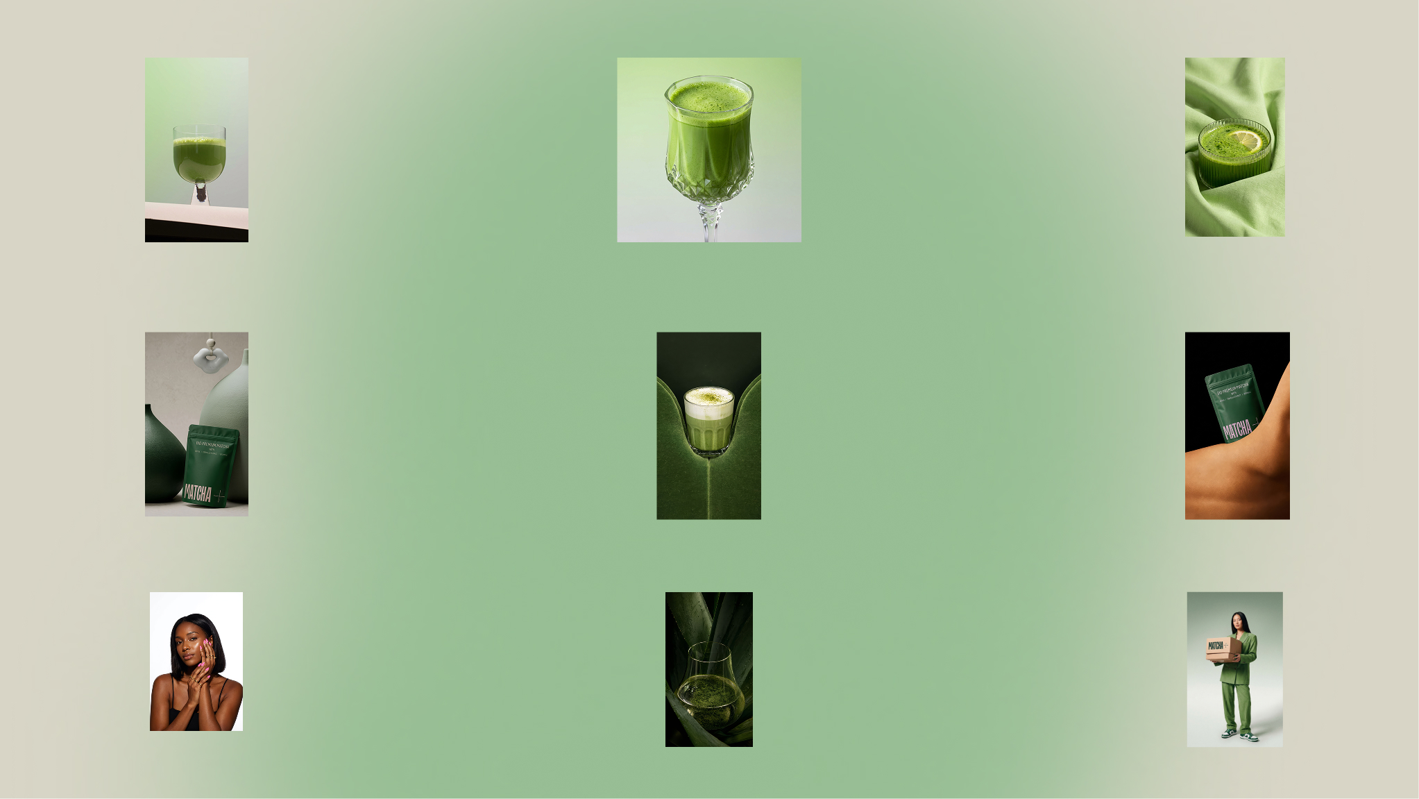
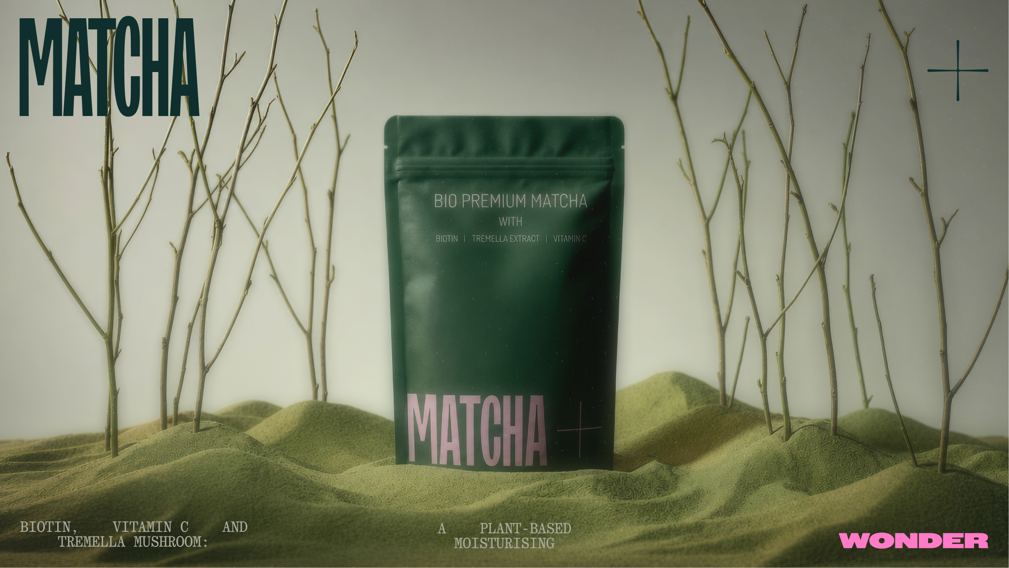
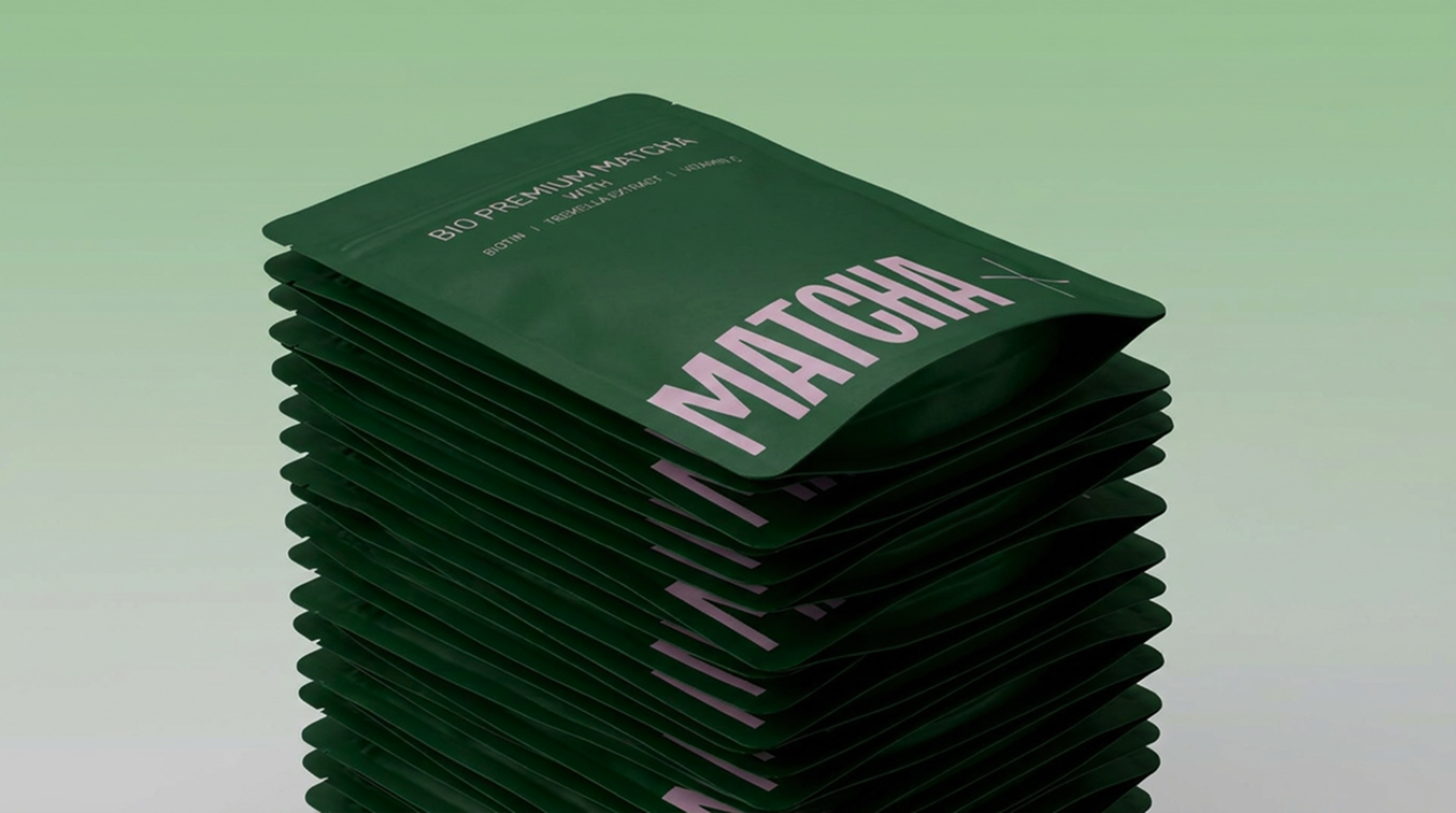
A stripped-back packaging approach with bold typography and a distinctive “+” accent. The visual system leverages the product and packaging as primary brand assets for a clear market entry. My work involved art direction with AI tools for the initial launch. Designing the packaging and design system to be used for the brand.
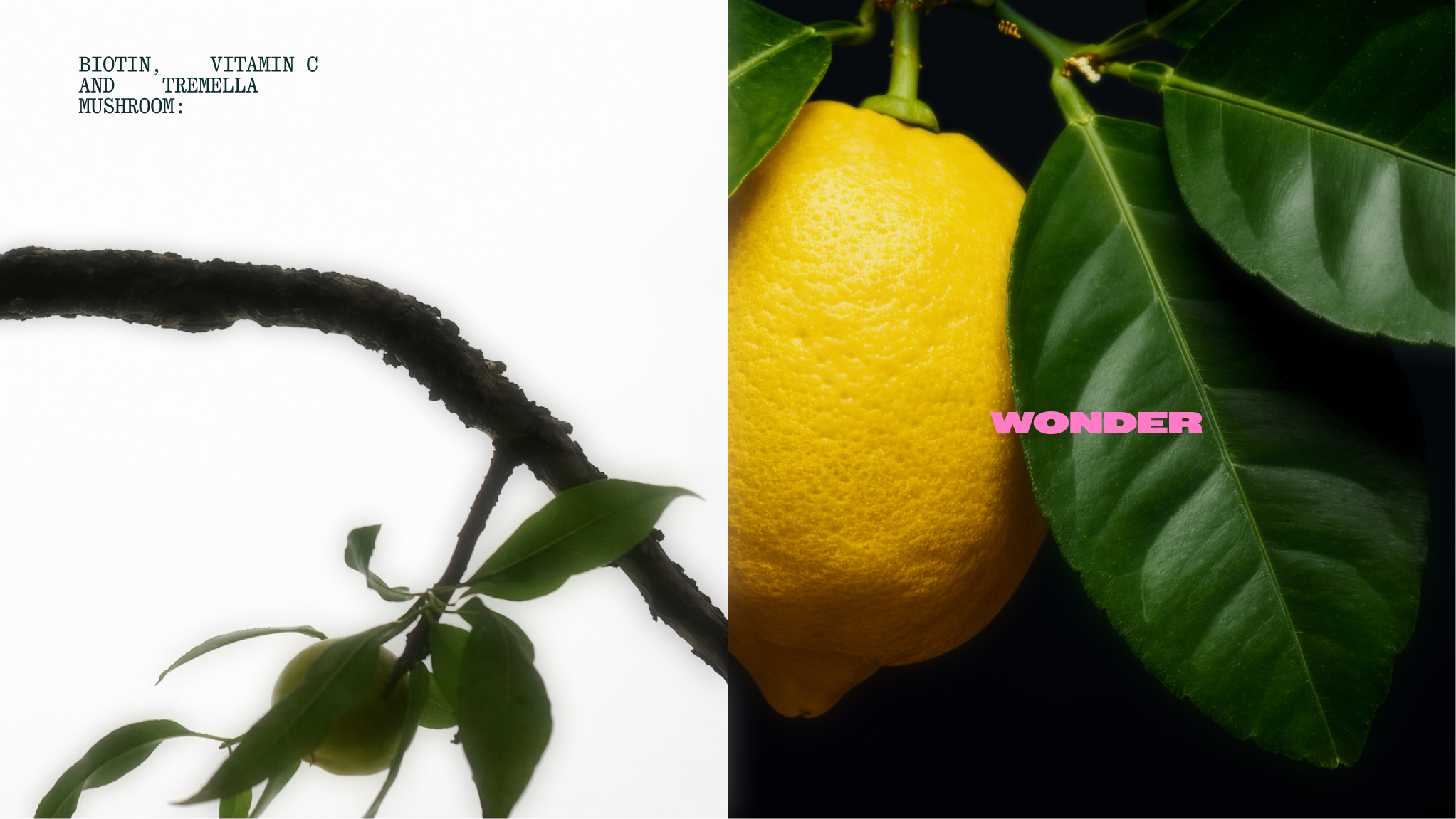
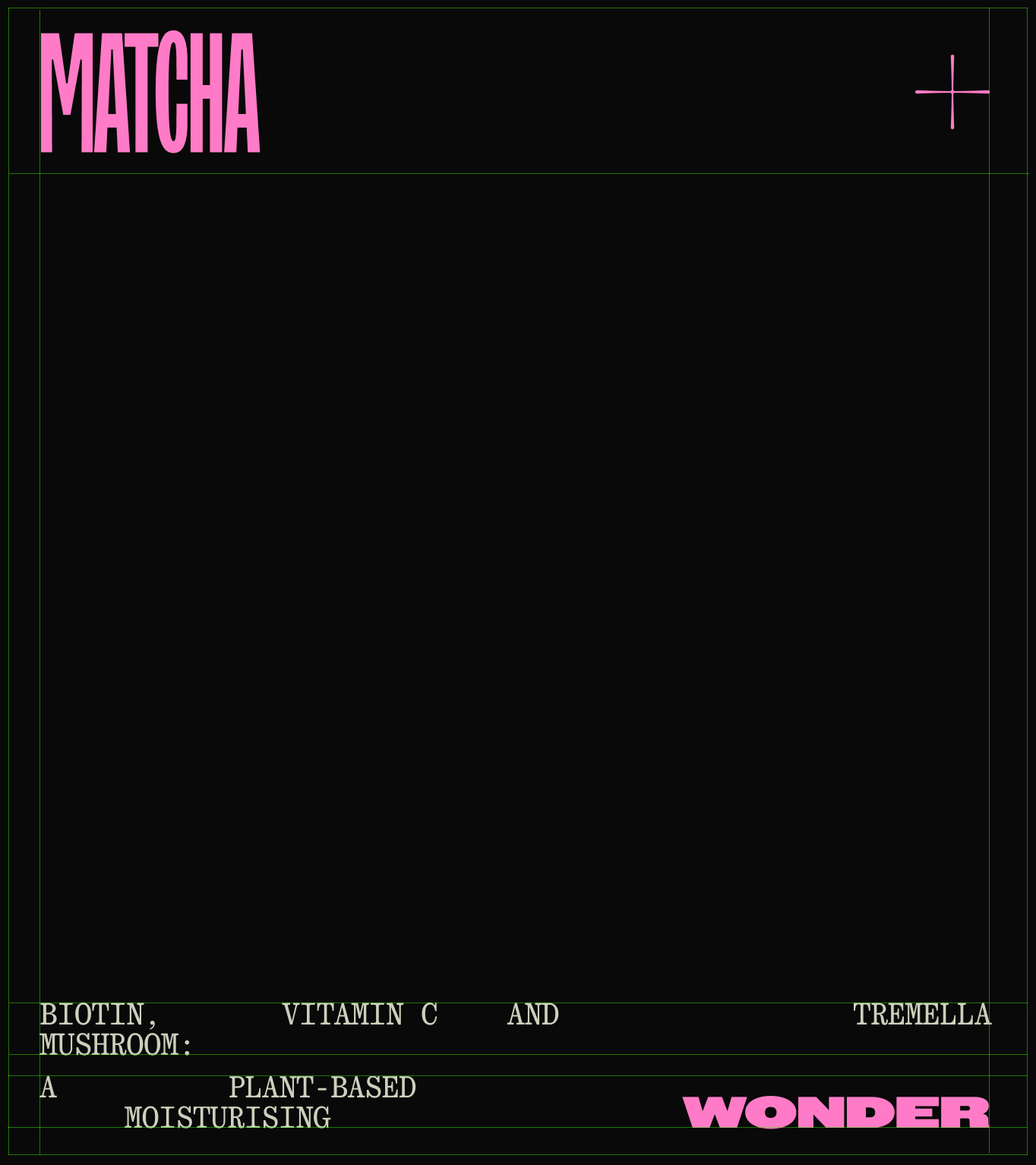
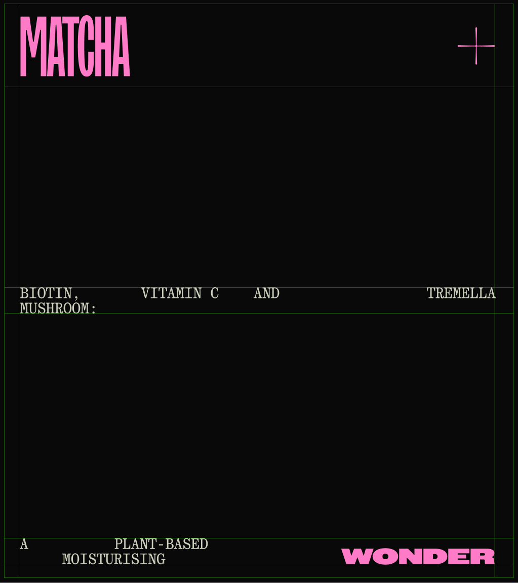
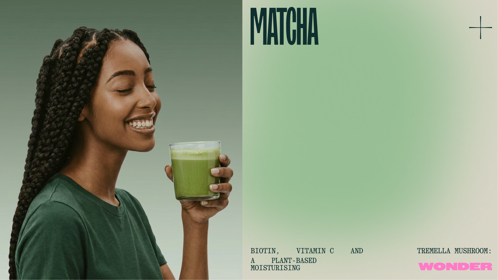
Typographic system designed from the logo. The word 'wonder' is always emphasized to match the brand's differentiator from other matcha products.