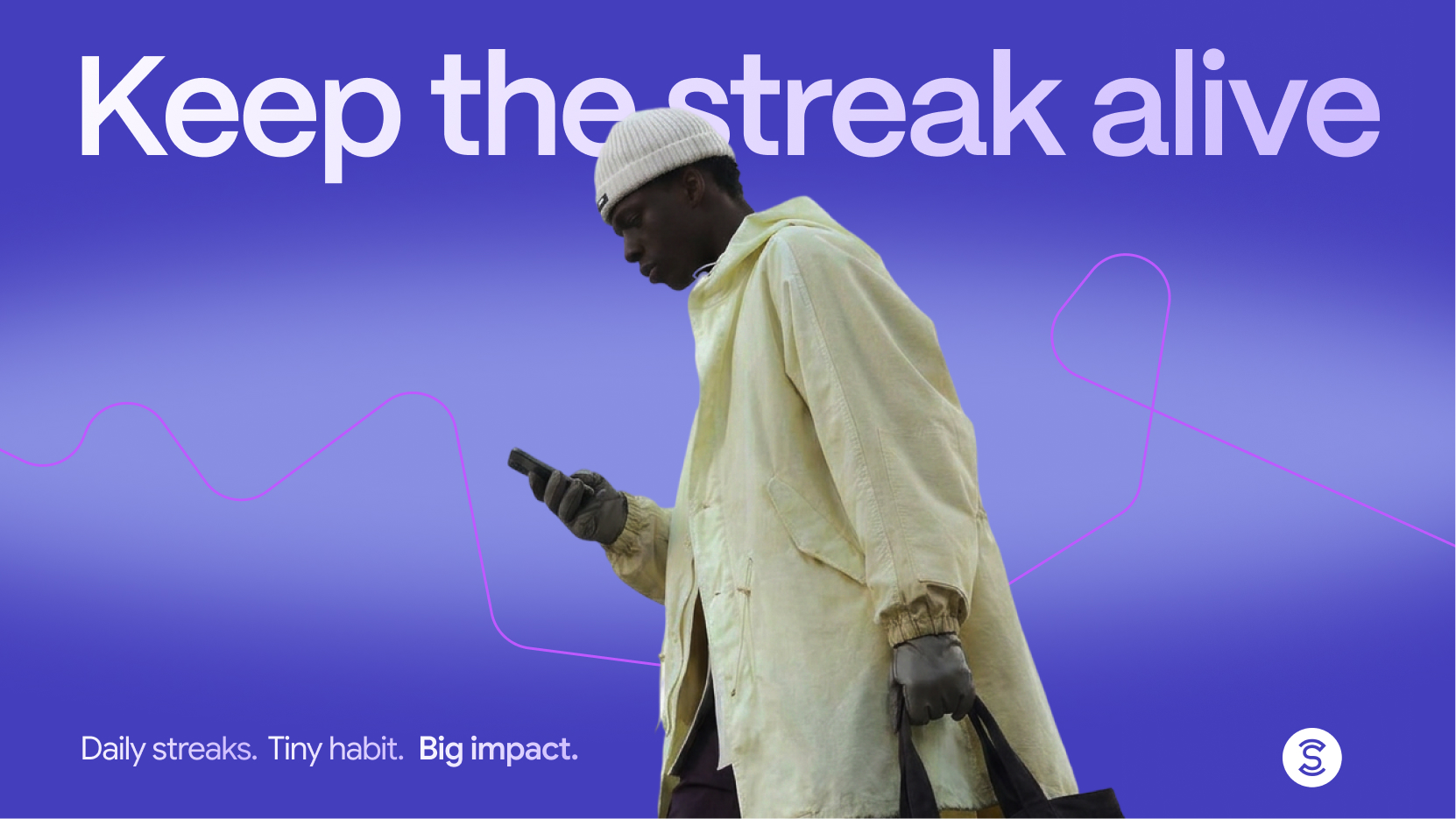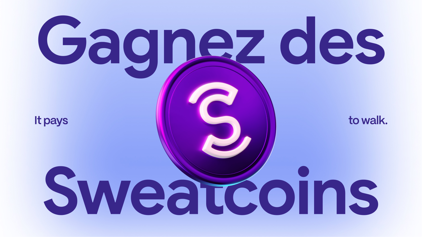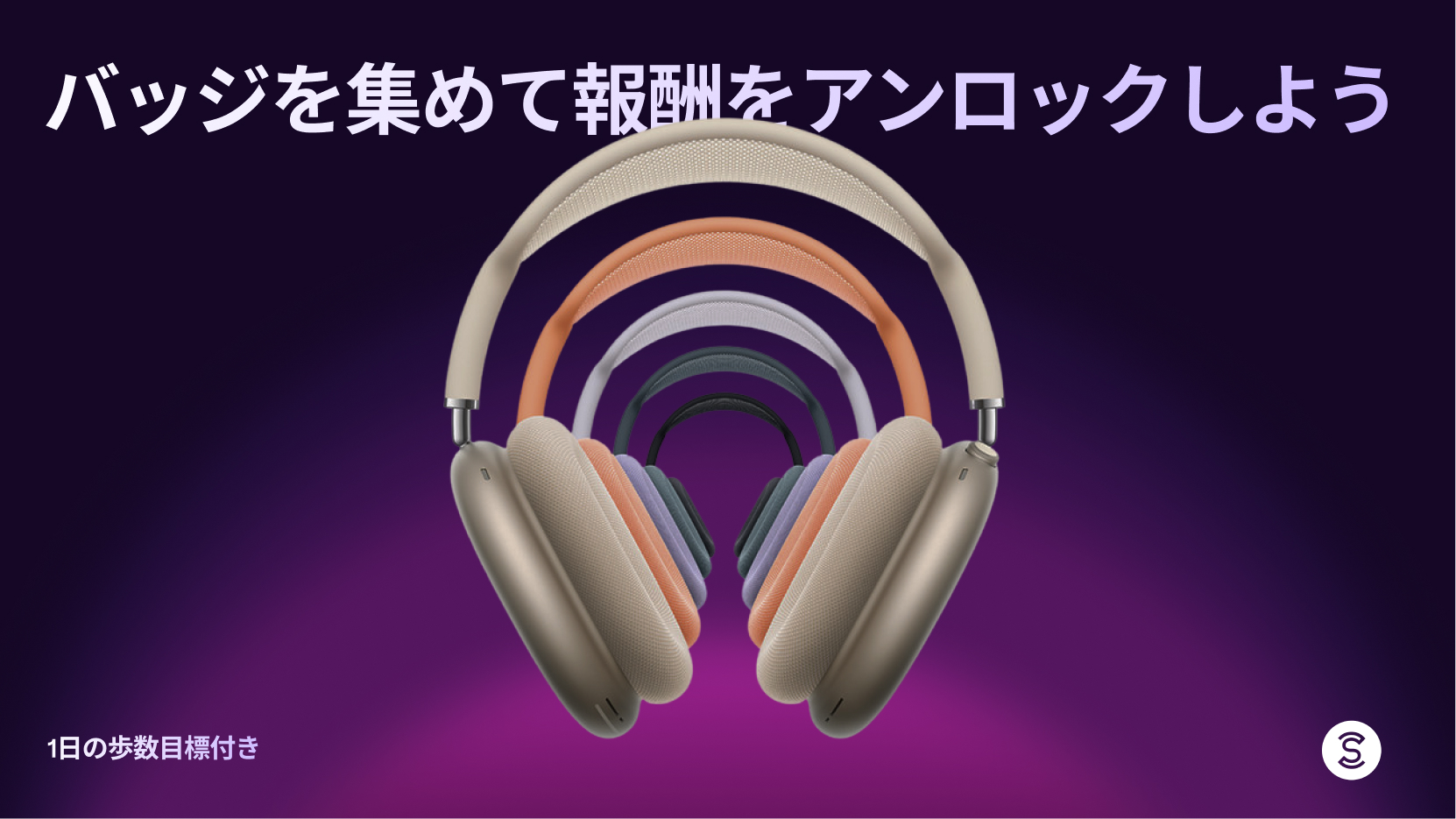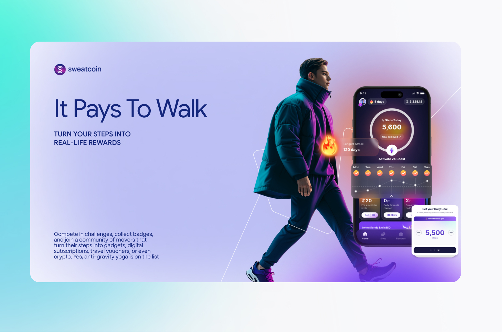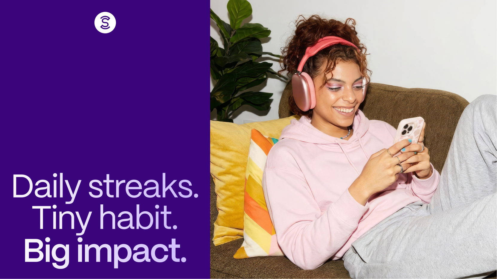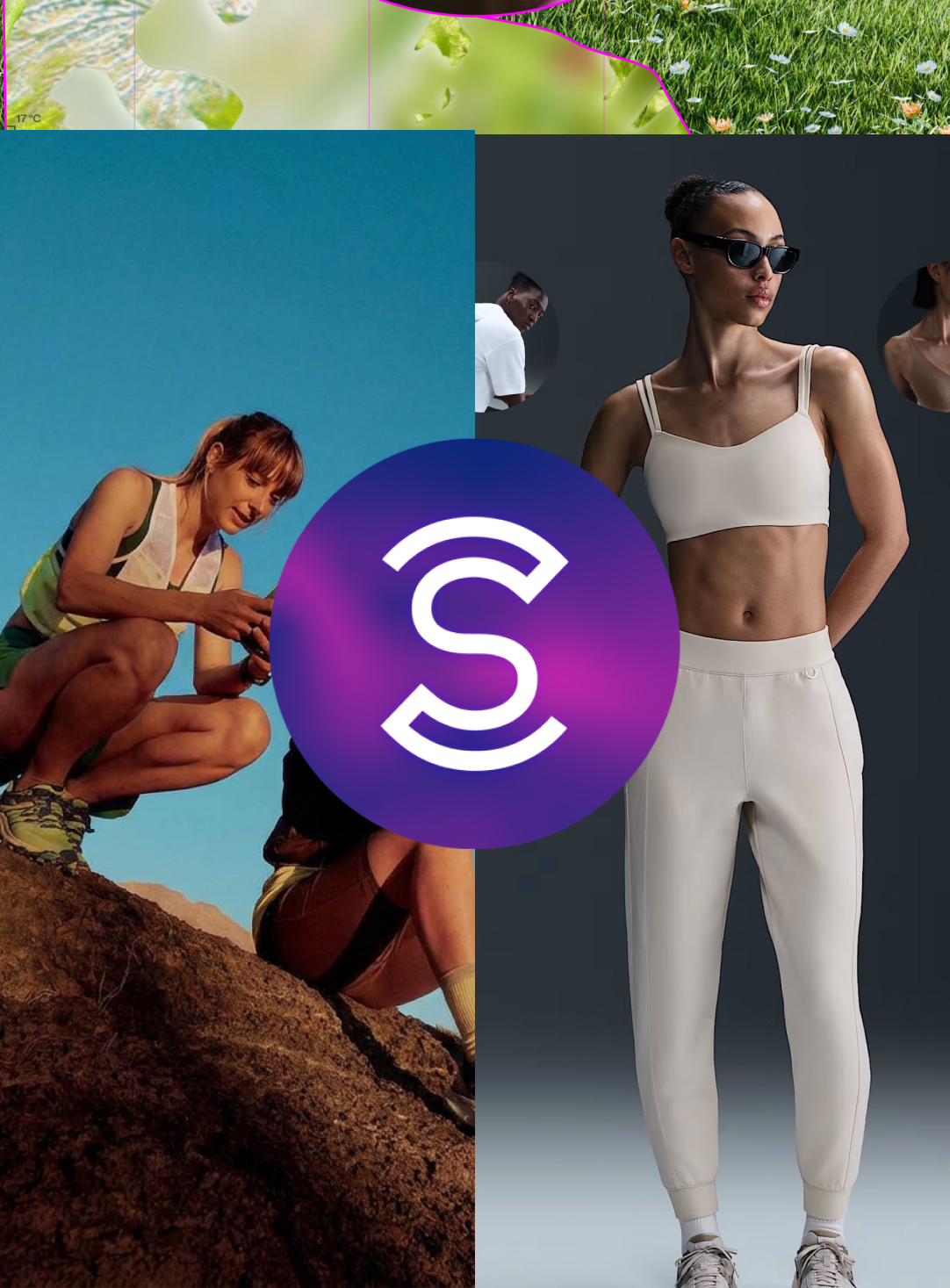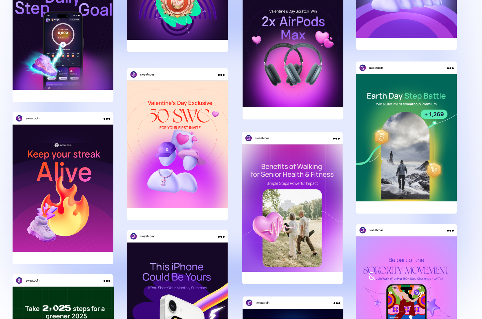


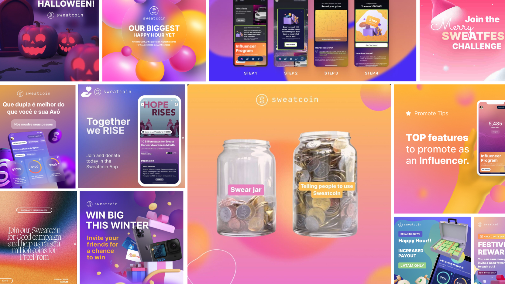
Before - inconsistency with typography, colors and imagery used for all the marketing materials. The app screens were outdate and didn't show what the app experience was.
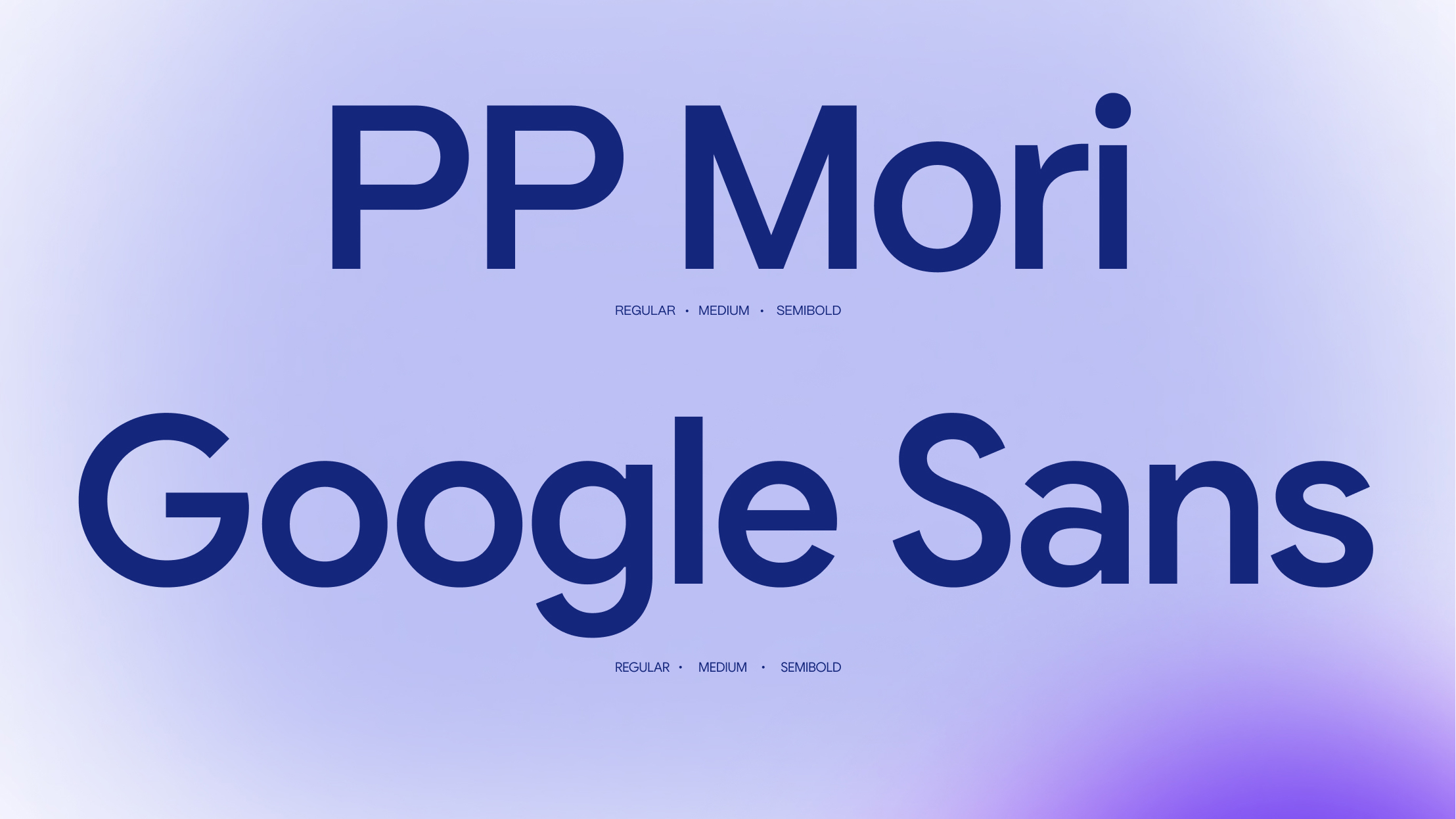
The new design system started with using colors that we're used in the product design. Followed up by working on unified typography for all marketing visuals and decks.


Colors - Sweatcoin offers the free version of the app and the Premium one. We've developed the colors based on the two versions of the app and suited for different visuals. Having this in place brought more consistency within the brand.
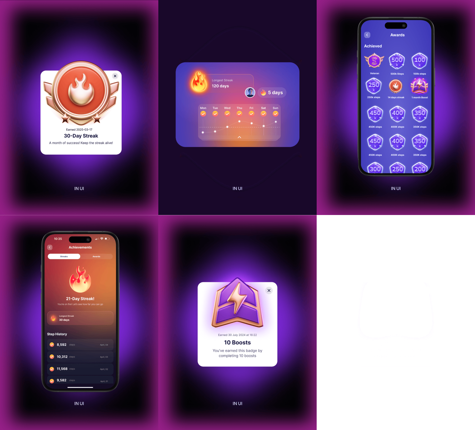
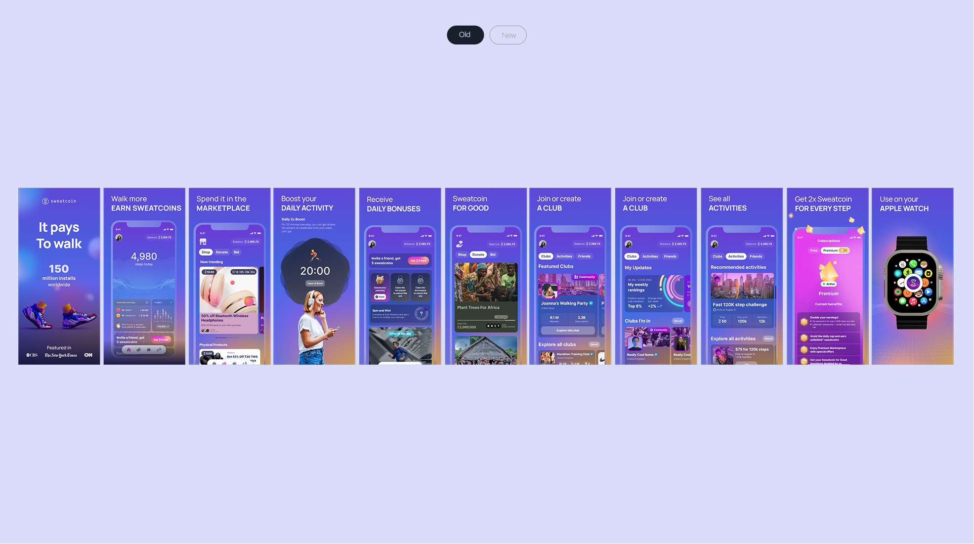
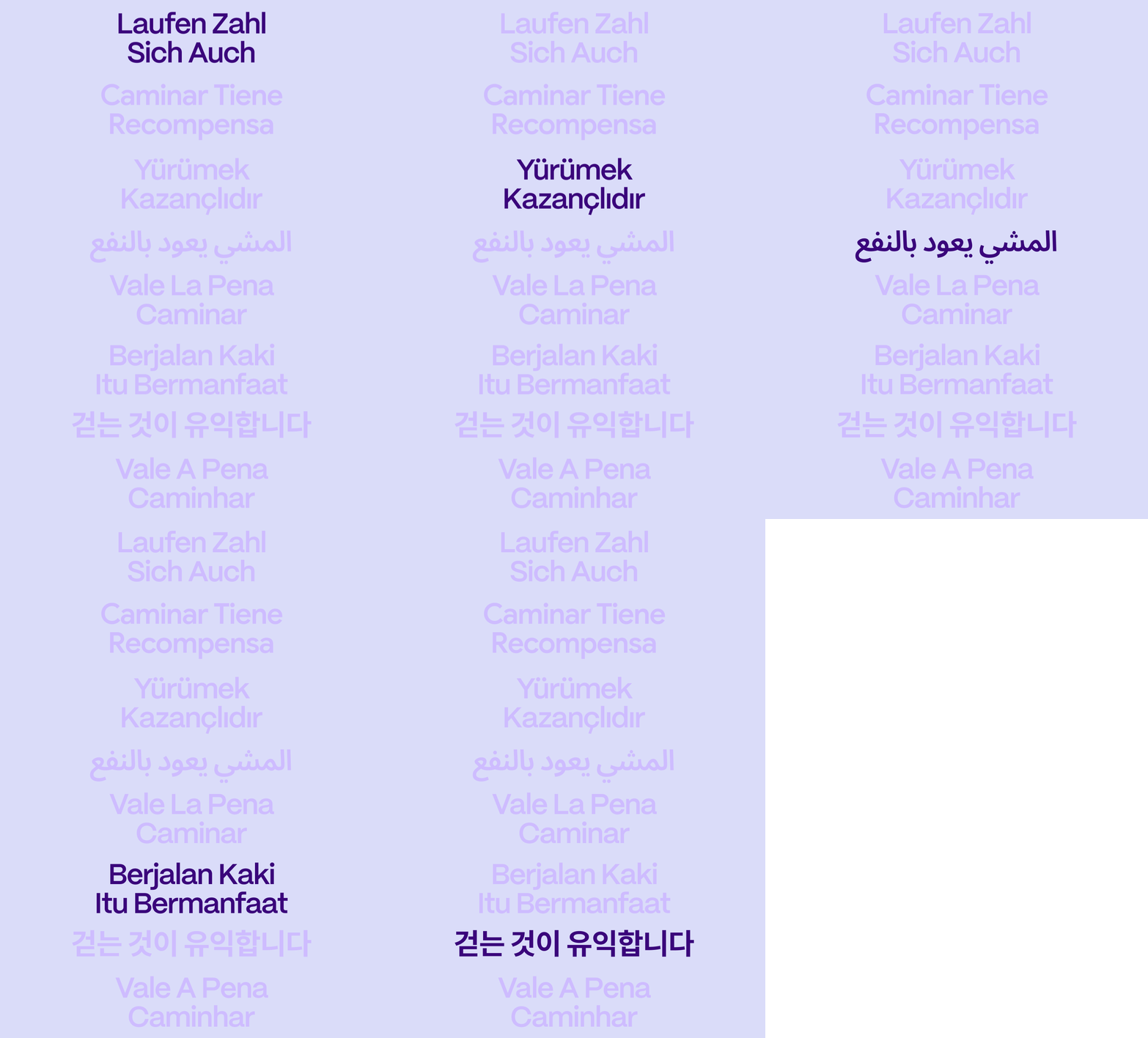
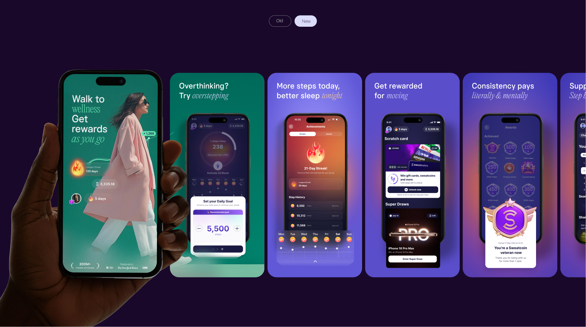
A key design task was updating an improving the app store screens. As the app is worldwide the screens had to be designed for specific regions and have the language set for the countries from those regions. Redisigning the screens with what the actual app looks like and offeres incresed the daily new registrations.
Nike collab - the sales team made a deal with Nike for campains within the app. I worked on these campaigns across marketing and product. Each campaign was themed. With the graphic design team's work Nike continued to partner with Sweatcoin bringing revenue for both companies.